Phil Moir's Blog
Welcome to the new Genes Reunited blog!
- We regularly add blogs covering a variety of topics. You can add your own comments at the bottom.
- The Genes Reunited Team will be writing blogs and keeping you up to date with changes happening on the site.
- In the future we hope to have guest bloggers that will be able to give you tips and advice as to how to trace your family history.
- The blogs will have various privacy settings, so that you can choose who you share your blog with.
Official Blogs
Technical Update - 15th February 2012
It has been a few weeks since I posted a Technical Update, and I wouldn't want anyone thinking that we've been slacking. I'm sure you are all very aware that we have made some changes, many have been behind the scenes, some more up front. From a performance and stability and evolutionary point of view they have been quite significant, and looking at the statistics of the site running, and the general volume of feedback from members, we are now heading in the right direction. But of course there will be more improvements coming very soon.
New Tree
Back in November last year we introduced some members to the new Genes Reunited tree tool under a beta test environment. The functions of the new tree have changed little from the existing tree, but under the covers it has had a major overhaul. The code for the existing tree was old, bloated, was difficult to maintain and develop for the future. So early last year we set up a dedicated team to look at the tree and redesign the tree code with the future in mind. At the beginning of this year (2012), we rolled the new tree out to all users, but had to withdraw it, after experiencing some issues not been identified during beta testing. With today's release, we have re-released it as the primary tree tool for all users, but we also have kept a link to the old version of the tree in case you hit a problem. Some of you have loved the new tree, others less so, while some actively dislike it. Unfortunately the old tree just cannot be maintained in its current state and facilitate some of the changes coming, such as multiple trees, security options, better printing, alternative displays, etc., so we won't be able to support both going into the future. The best advice I can give you all is to use the tree feedback option that appears on the header section of the tree. Here is a quick guide to some of the tree-related changes.
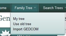
Link to the old tree is under the Family Tree menu option
On first glance, there isn't too much change to the display. We have tried to maximise the screen space for the tree, so the default person view at the foot of the screen has been moved. All the menu options for immediate family, full family, ancestors, descendants, hot matches, clipboard and printing are still there. The drop down to select either your tree or any other trees visible to you is on the left. The search has been moved to the upper right corner. The person editing screen is on a sliding page that appears from the right hand side. On the right hand side of the screen, in the middle, there is a tab feature. It is highlighted when you first go into the tree (see image below). Click on this and the editable view pulls across the screen.
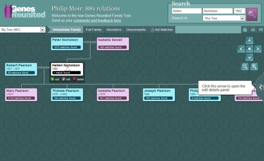
New tree is not that different on the outside to the old tree
The Details editing page has been increased in size and the font size has been increased also. The editable fields can be scrolled up and down to see all the information that was previously held.
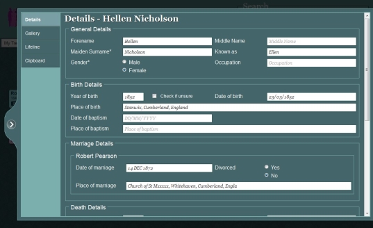
Details tab for editing a person is more spaced out and text is larger
The Gallery is on a separate tab, and the timeline has been improved to display more details and more accurately. While the clipboard works as before to assist copying data from one person to the next.
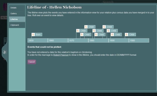
Timeline tab has been made more accurate
As I mentioned before, we had to re-develop the tree to support some of the features we have been consistently asked time and again to provide. In addition we have tried to make other features work better. We may or may not have got these perfected yet, so please let us know what you think. Let us know where the tree does not function and equally functions better. To provide feedback, click on the link by "Send us your comments and feedback here" or the menu icon to the right of the printer icon.
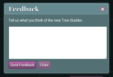
Please send us your feedback on the tree
Other Changes
On the home page we have reintroduced the Activity Alert on the Home page, but with a few improvements. Firstly any stickied post from the Announcements board will be shown here. Not in full detail, but the header and initial description, and it will include a link to the full announcement. This will help us distribute immediate news through the site, which has been asked for many times. This box will also contain up to five personal alerts to indicate when we last checked for Hot Matches, World War Matches, and other activities that are carried out for your benefit.
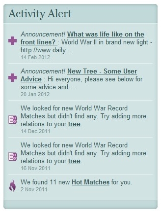
Activity Alert box on Home page
The release we did in mid January contained a few page rewrites. Like the tree, this was not to introduce features, but to migrate legacy code into new. The areas affected include the Photos and Videos section, which was previously hidden behind an obscure link on the Home page, but now has a dedicated link on the Community menu. Also the FAQs section under Help and the Maps under Search Results had to be re-written.
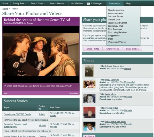
Photos and Videos under Community menu
- Broken links - We realise that many of you have saved links to old pages, or use search engines to return to previous pages, and as we redevelop Genes some of these old pages no longer exist. These requests are recorded and we have tried to identify and redirect to the correct new page as many of these broken links as possible. In some cases there just isn't a corresponding link, but don't despair, we will make the best attempt to guide you to the right place.
- Attaching records - During the legacy clearout we came across a number of issues with attaching records. We have fixed all the ones we found, and you should be able to link these to your tree correctly now.
- Showing the right price - A good number of you have queried the price of viewing images and transcriptions. As a general rule, we have always shown the full price of viewing an item, regardless of whether it is included in your package or you have previously viewed the items on credits. We now display the actual price (in credits) of an item appropriate to your account. So for a Platinum member, all BMDs and Census records will show as Free, as will any specialist records if included in a purchased Feature. For a member using credits, if you have viewed an item already and it is still within your viewing period, it will also show as Free. Otherwise the credit price will be shown.
- Going to wrong BNA page - We have identified and corrected a situation where the wrong newspaper page was being displayed.
- Reply icon attached to wrong message - When a conversation existed and a member replied to a message later in the conversation, that message was not being flagged as replied to. In fact the reply icon was being placed against the initial conversation message. This issue has now been fixed.
- Redirecting you to the right page after purchase - When you try to view a record that you are required to purchase credits, a package or feature for, after you have successfully paid, you will now have a link directly back to the original record you were trying to view.
- Telling you why you need to purchase a package or credits - We are trying to help give better guidance throughout the site, and many people are confused when they try to view something and end up at the subscribe section. Firstly we have changed things around so that if you are a Standard or Gold member, we will direct you to the Pay Per View (Credits) option first, as this is more likely your preferred purchase choice. If you are a registered (non-paying) or Platinum member, then we guide you to the subscription page but we will tell you why, such as you are required to include the Additional Feature option if viewing Travel, Military, Parish or British Newspaper Archive records.
- Infirmity column now visible on 1911 census images - We are now permitted to show you the contents of the previously hidden Infirmity column on the 1911 census images.
- Hot Matches - We are continuing to tweak this process to ensure as many of you as possible get matches notifications. This is an ongoing process.
We have made more changes but this covers the main ones. As always I would love to hear any feedback you may have and I will do my best to respond as quick as I can. In the meantime, I hope you continue to enjoy the site, and if any of you are planning on attending the "Who Do You Think You Are" show at Olympia, London this coming weekend, then please drop by the stand. I will unfortunately only be able to attend on the Friday, but would love to meet as many of you as possible.
Best regards, Phil Moir
Genes Reunited, Lead Developer
Comments
|
Send Message |
Thank you for that Phil. I look forward to the future tree enhancements.
|
|
Send Message |
Phil,
thank you for the detailed breakdown of what has been altered, fine-tuned, edited out, added in etc. This detailed breakdown should certainly answer many queries. From some communication I have with others on the site, it amazes me that for quite a number the underlying comment seems to be that they don't like all the ancestors details taking up so much room on the page & very few of these GR members seem to pay any attention to social history which is so incredibly helpful to rounding out the "bare name, etc" I find it hard to understand all the hours just sourcing lists of names & minimal details when quite often there are major mistakes made which would be so much more obvious if some social history was noted. I for one, really appreciate all the work you & the team are putting in but sorry it's too far for me to come to London - earthquake devastated Christchurch, N.Z. is keeping me fully occupied & well shaken about - 10,280 quakes so far in 16 mths! pelo :-) :-) |
|
Send Message |
Phil,
Your example of your tree above shows three generations on one screen. To get from (for example) my grandparents to my great grandparents takes 22 drags downwards of the page to get to the next generation. How do you get THREE generations showing together? That is why I think this new tree is unworkable and I have already stopped using this site in favour of Ancestry and won't bother to re-new. Such a shame as I used to recomend GR as having the best tree on-line to friends starting off. DF ps I realise that you can type in a name in the search box but you can't if you can't remember the next generation off by heart each time. |
|
Send Message |
Thanks for the comments and feedback. It is much appreciated.
DF, I tend not to use the full tree view myself (although I do realise it is a really useful tool for some people), but prefer to step up a level one at a time. Each time you select a person, it move them to the middle and displays children and parents and siblings. As long as you keep stepping back like this, you should always see the three generations together. I then select the ancestors and descendants view from this selection, and print from there. Hopefully you'll keep watching as we evolve and maybe be back as a member in the future when we meet your needs. |
|
Send Message |
Phil
Thank you very much for this very full report on changes made. Many thanks for all your efforts. sylvia |
|
Send Message |
20-02-2012 Greetings !
Can you please tell me how to find on the GR website the list of what it costs in Pay-per-View searching for each of the kinds of record. Maybe I'm stupid, but I haven't yet found where you hide this information, if it exists on line. For example : I am a standard member and I have a balance of 20 credits. I wish to consult a 1911 census for a household, but am not told how many credits are required, yet I am redirected to the page for purchasing more credits, so assume my 20 are not enough ? Have you published the tariff somewhere, for the UK censuses, for the other historic records that require credits for consultation, etc ? Regards Ken B. (in France) |
|
Send Message |
Phil,
Thanks for this update. I keep trying to use this new tree but I still don't like the 'fly-out' covering the tree view... grr! I'll send you some further comments using the feedback link on the new tree page. Simon Actually, I've just tried using that feedback link and it doesn't seem to work!! So here are my comments... HI GR Team, Thanks for Phil's recent update. I keep trying to use this new tree but I still don't like the 'fly-out' covering the tree view... grr! A couple of things which I haven't mentioned previously. In the screenshot in Phil's blog, the completed information fields appear to show emboldened text whereas the uncompleted fields have regular text saying "Middle Name", etc. If we have to have the text saying '"Middle Name" :-(, and it's so much easier to read the page with blank space in uncompleted fields), can we have the completed fields in a different font? I have to say, I prefer Ariel (or any non-serif font) to the italicised font you now use. Secondly. In the good old version :-), the name of an individual who's detail was being worked on was always shown in the Search box at the head of the page. In the new version this doesn't seem to happen. I certainly find it very useful to have their name displayed there so that I can very quickly and easily search my tree to see if I already have anybody with the same name and same or similar dob. (In a tree with multiple cases of cousins - and other rellies - marrying each other I frequently find the same individuals cropping up time and again.) With the new tree I now have to type in the person's name (and dob) each and every time I want to find duplicates... Ah, just tried it again and it does now seem to show the name in the Search box. Umm... another intermittent problem?... Another thing... I frequently want to copy information from other web pages into the Nots field. In the old tree I was usually able to simply highlight the text I wanted and drag it across into the Notes field. I now find I can't do this, and I have to copy and paste. OK, it's only a couple of extra clicks here and there - but they all add up! (Yes, Pelo, I may have a large tree - but I have 'social history' notes for the majority of my names.) Also (you can tell that I'm finding more as I spend more time using the tree!) It might be useful to have the 'Save' button in the margin on the left side of the Fly-out. At present it's down at the bottom of the fly-out, which means you always have to scroll down the page to get to it. Hmm, now all of the Marriage fields seem to have disappeared! Oh, and now I've got multiple copies of individuals showing on my tree!!!! Aaaargh! Back to the old version... Simon |
|
Send Message |
Hi
I've spent a long time attaching births, marriages, deaths and census records to the people in my old tree. Some have 'moved' to the new tree, but not all. Very frustrating having to check them all again. Also messages that say 'events occurring after death' and 'marriage not in correct format' are not correct. I'm beginning to doubt my own sanity! Has anyone else had the same problems? Fiona |
|
Send Message |
Phil
I have NEVER been able to open the new tree and now I can't even open the old tree option as the old tree url now flips to the new tree url that just hangs forever. In despair! Mark |
|
Send Message |
Phil
It's just taken me over 7 minutes just to login to your site. So the issues with the new tree seem rather insignificant. I'll send you a copy of the e-mail I've just sent to your "support" team (I have your e-mail address from a previous conversation when you first introduced this new tree with all the major bugs.) It takes ages to get trees to open with the new tree. It is just not fit for purpose. I have plenty of memory on my PC. My internet bandwidth is average. I have the same experience on both Google Chrome and Internet Explorer. And when the tree does eventually open, there is no where to enter marriage details I challenge you tell me that this has been tested thoroughly with real users using your site over the internet. Anyway better do some research now before I'm timed out (yes this is another problem with your website)... once I'm timed out it will take another ten minutes to login again!! Regards |
|
Send Message |
I am EXTREMELY dissapointed with the new format a case of fixing something that wasn't broken. I have spent an enormous amount of time working on your site and maybe your customers should be cosidered before you make drastic changes.
I am very unhappy |
|
Send Message |
Firstly, thank you for all of your hard work.
BUT. 1) Loading the first page on this site is the slowest of any site that I use on the internet (and I use lots!) 2) I reported a bug in the search trees area last November that still has not been fixed. It makes the one area of the site that I use the most (particularly as I haven't had any hot matches for many weeks) unreliable. It should be easy to fix. (It is to do with adding a place name to a search. Eg Search for Samuel Weston born 1820, you will see 3 entries for him in Barlestone. If you then add Barlestone to the search, you will get 0 returns). I would love to see this bug fixed |
|
Send Message |
Having the option to use 'old' or 'new' tree versions has made me realise how adequate, simple, logical and sensible the 'old' one is, compared with the frustrating, irritating, awful 'new' one. I can see no virtues whatsoever in the new system. The new 'Lifeline' option etc I shall never use. The horrible sliding shutter thing is a disaster (plus your chosen font is terrible). I could go on and on but have already made other criticisms via your feedback system which have fallen on stony ground.
Provided the 'old' system remains available, I will continue to use your site, but if this is withdrawn, reluctantly my subscriptions will stop. A very disappointed Robert Milton |
|
Send Message |
Over the past few weeks I have run into several problems when trying to access member's trees. In the main access seems to be much slower than previously and in some cases when clicking on a link to do so I get an error message 500 and in others a spinning icon and I nevere get to the page even afer several attampts. It appears there are definite issues which are most annoying.
When I have gained access to a members tree inserting a surname which I know must exist in the Search area results in a negative result. Clicking on a name included in a result often asks for a full name in the Search area which when given still persists on asking for the same full name. Gerald Lawson :-S |
|
Send Message |
I've still got the error problem please fix mine
|
|
Send Message |
I only recently renewed my membership and still prefer the old tree. I am concerned that what ever I search for the answer has to be sought by scrolling down humongous amounts of the same stuff which starts with the advert for bank of scotland then the genes reunited header then the list of associates eg friends reunited then the further sists of my account etc then the tesco advertisemant then somewhere after all this is my answer. Not really impressed Genes reunited I have used this site for years but it is now so cumbersome and I am not alone in this . I wish I had only renewed for a month and not for 6 months.
|
|
Send Message |
Hi Phil......
I have been told by the support team to contact you on here :-S regarding my missing thread , "What Book are You Reading"......its gone again and this is the 4th time its happened :-| Ive never had to contact you via this way before but if its a way of getting the thread back than so be it......... Im very grumpy and so are a few others .........PLEASE HELP!!! |
|
Send Message |
It takes twice as long to do stuff like searching and attaching records. I stopped using the tree about 2 years ago and decided to come back last week as a platinum member and wish I hadnt bothered. What a waste of money.
|

